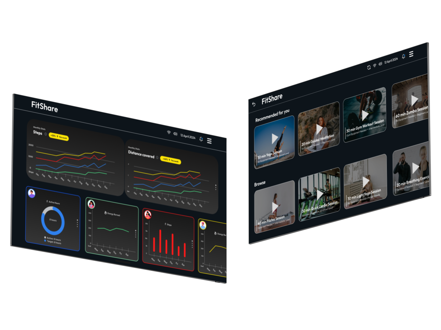
For adults who want to promote household wellbeing, FitShare is an interactive fitness hub that offers visualisation of household members' health metrics and recommends personalised activities.
Project Duration: 3 months
Role UI/UX Designer

User Research
-
Semi-structured Interviews:
6 participants - 4 females and 2 males, all regular gym-goers in their 20s, were interviewed to understand their experiences with health tracking apps and wearables. -
Co-designing:
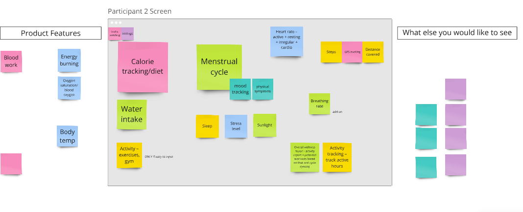
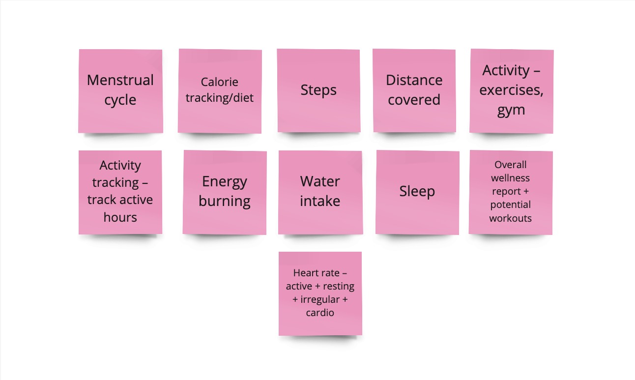
During the interviews, participants engaged in co-designing activities where they contributed ideas about how a health hub should function within a household. Using the Miro collaboration tool, participants brainstormed what health metrics they would want on the hub and how they’d prefer to interact with it.
-
Empathy Mapping
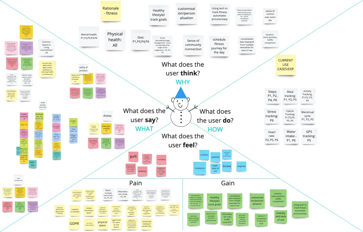
The team created empathy maps to capture what users say, think, do, and feel about health tracking and privacy.
Key takeaways from this process included:
- What they say: Users preferred placing the Health Hub in communal areas like the kitchen or living room. Privacy was a major concern, with one user noting, "I want my menstrual and sleep information to be private. I don’t want intrusive questions from flatmates."
- What they do: Regular gym-goers, participants were familiar with wearable tech, favouring tailored data presentations on the Health Hub
- What they think: Users saw the device as fostering household community, with 5 out of 6 believing it could also support mental well-being.
- What they feel: While excited, users were concerned about information overload and unhealthy competition, highlighting the need for balanced design features.
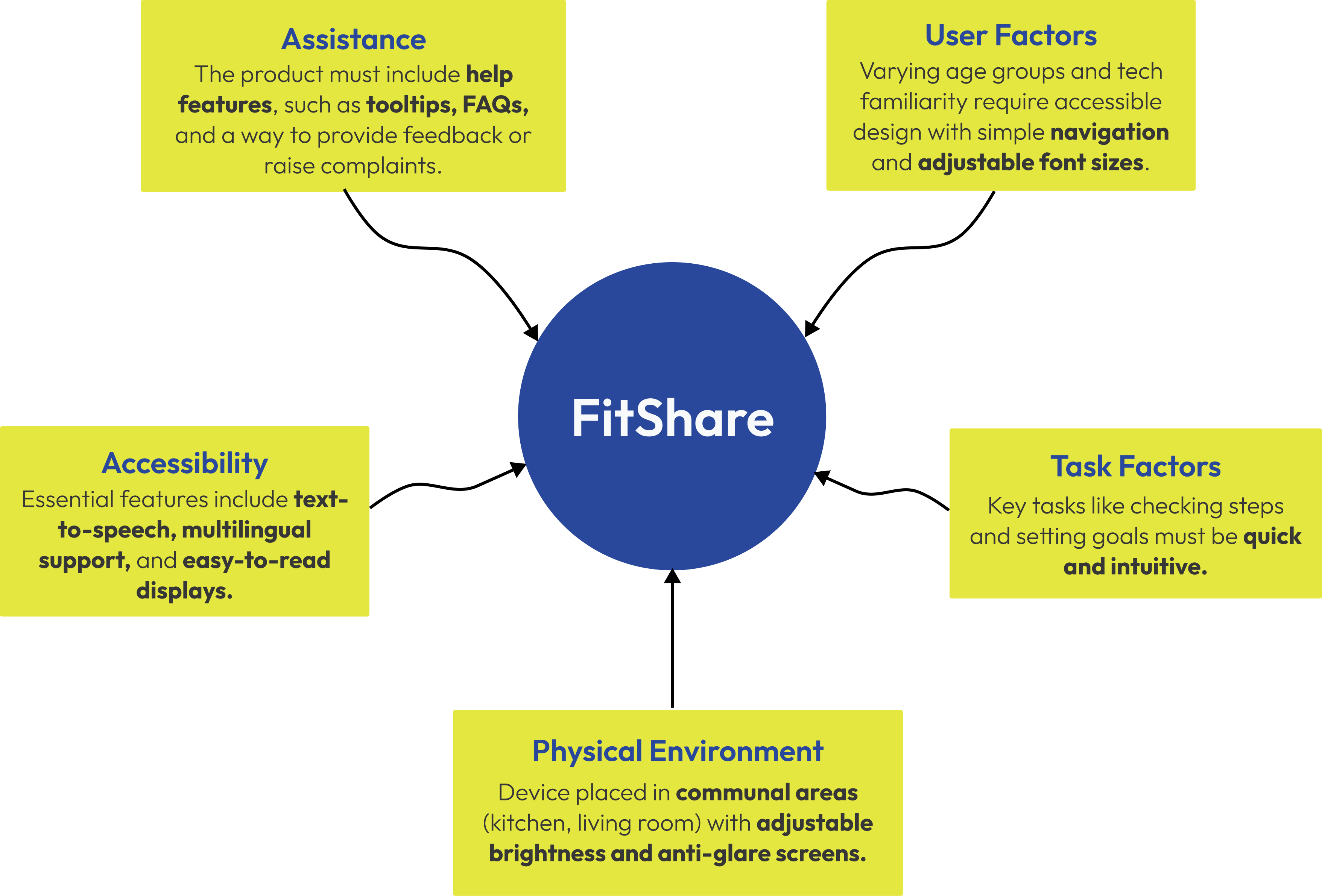
In the Define Phase, the team synthesised the insights gathered from user research and co-designing sessions into clear problem statements and design goals. This phase also involved conducting a Context-of-Use Analysis (CoUA) to better understand the real-world application of the product, followed by User Requirements Prioritisation using the MoSCoW Method.
The CoUA helped the team evaluate the various factors that could impact how FitShare would be used within households. It covered user factors, task factors, and physical environment factors. This analysis guided the design process to ensure FitShare would work well in various contexts.
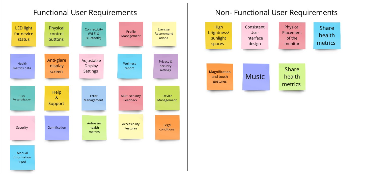
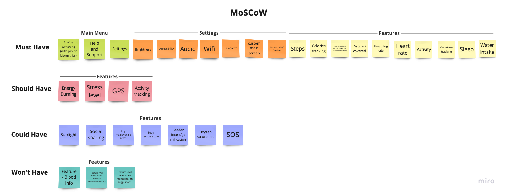
Based on the research insights and CoUA findings and the under interviews, the team defined a list of User Requirements (URs) categorised as functional and non-functional requirements, which were then prioritised using the MoSCoW method (Must have, Should have, Could have, Won’t have).
With clearly defined problem statements, the team began brainstorming solutions, incorporating feedback from the co-design sessions.
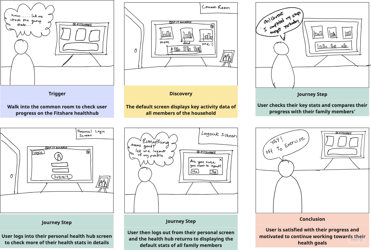
The team used insights from the co-design sessions to storyboard how FitShare would function in a typical household setting. This included scenarios where users set up personalised profiles and participate in group challenges.
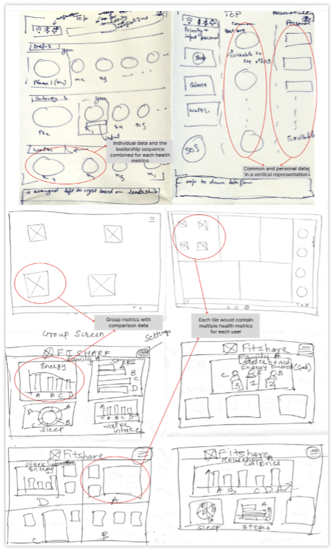
Rapid ideation sessions where each team member sketched out possible designs for key screens, such as the default dashboard and personal profile screens. The ideas generated here were influenced by users' suggestions in the interviews, such as placing health metrics like steps and calories at the forefront and giving clear visual indicators for privacy.
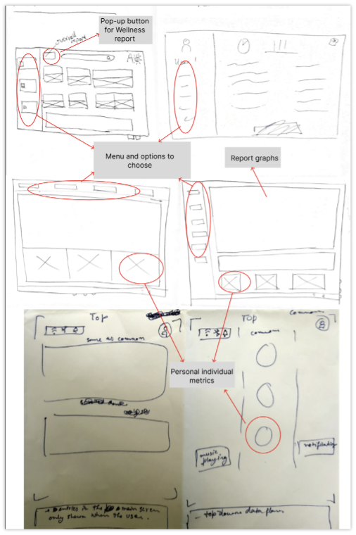
The next phase involved turning ideas into tangible solutions through designing screens and prototyping, incorporating user input from the co-design interviews.
We drew a simple flowchart to depict how we want the user journey to go. It was essential for us as a team to have a clear overview on how we would design the screens and how the screens would be linked to each other as well. These insights allowed us to address usability issues and optimize the user experience.
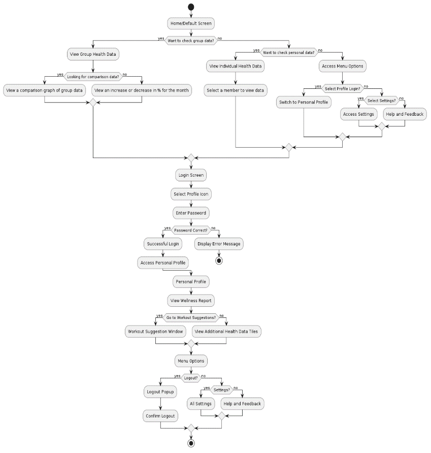
Based on co-design input, the default screen was designed to show public metrics for all family members, while the personal screen allowed for private viewing of sensitive data like stress levels and sleep quality.
We developed low-fi wireframes to layout the basic elements and functionalities. The wireframes were simple focusing on user data presentation and navigation.
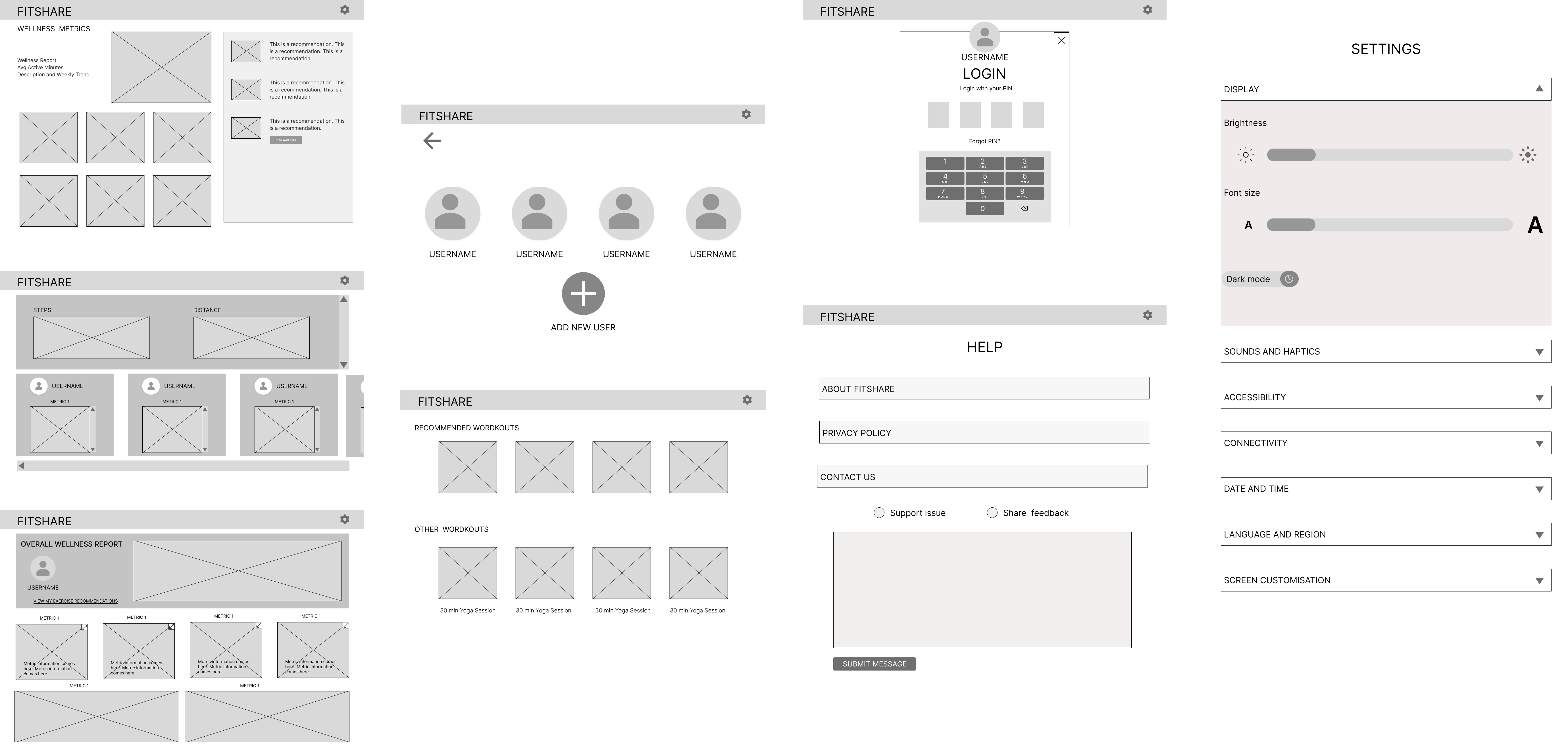
The low-fidelity wireframes were used to design the high-fidelity prototypes.
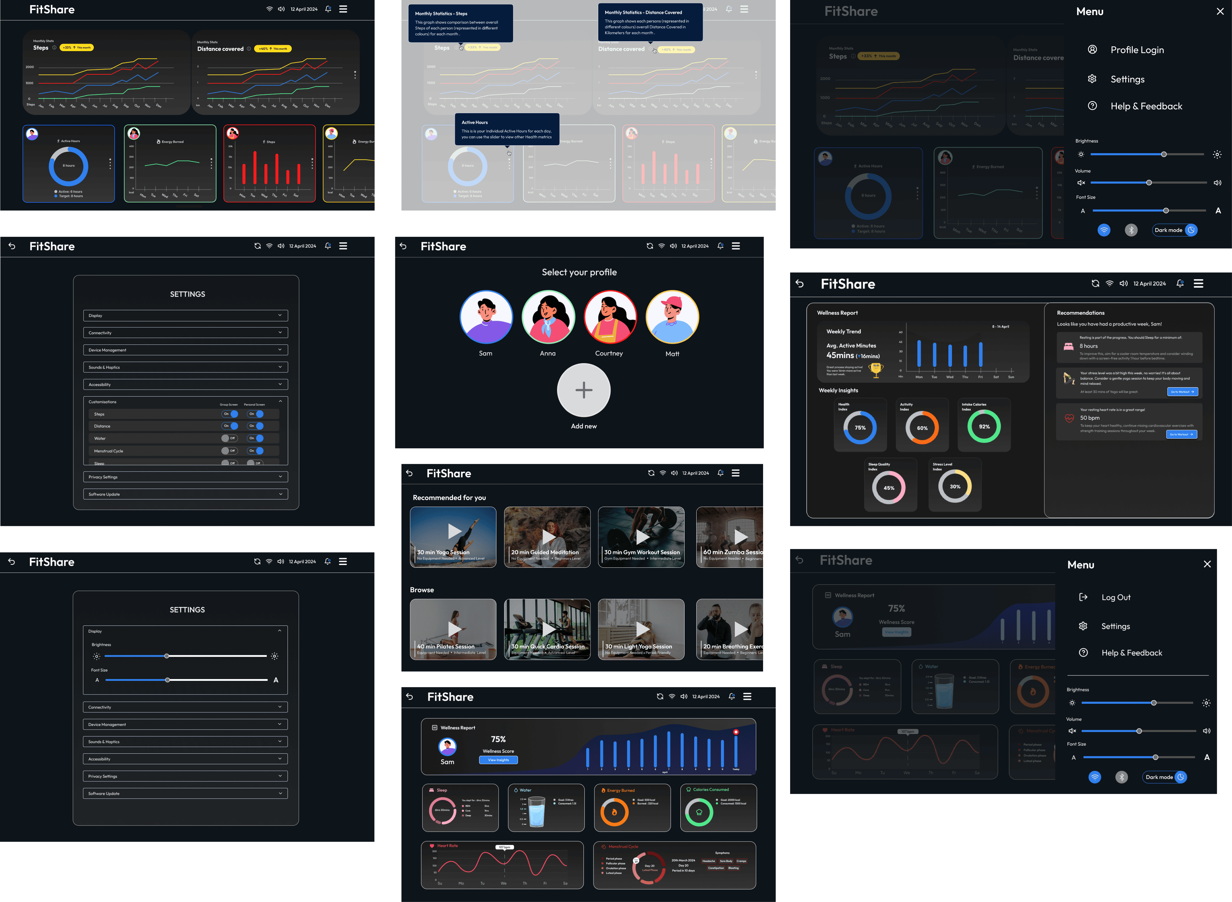
The final phase involved testing the prototype with users and iterating based on feedback.
5 Participants were invited to test the high-fidelity prototype. The testing involved completing tasks like checking daily steps, logging into personal profiles, and viewing wellness reports.
First Click Tests:
Participants were asked to locate key features, such as privacy toggles and the leaderboard. Feedback was collected on the intuitiveness of the navigation and ease of use.
Think-Out-Loud Protocol:
Users provided real-time feedback, discussing their thoughts while interacting with the app. The feedback focused on the clarity of visual elements, such as graph readability and tooltip placement.
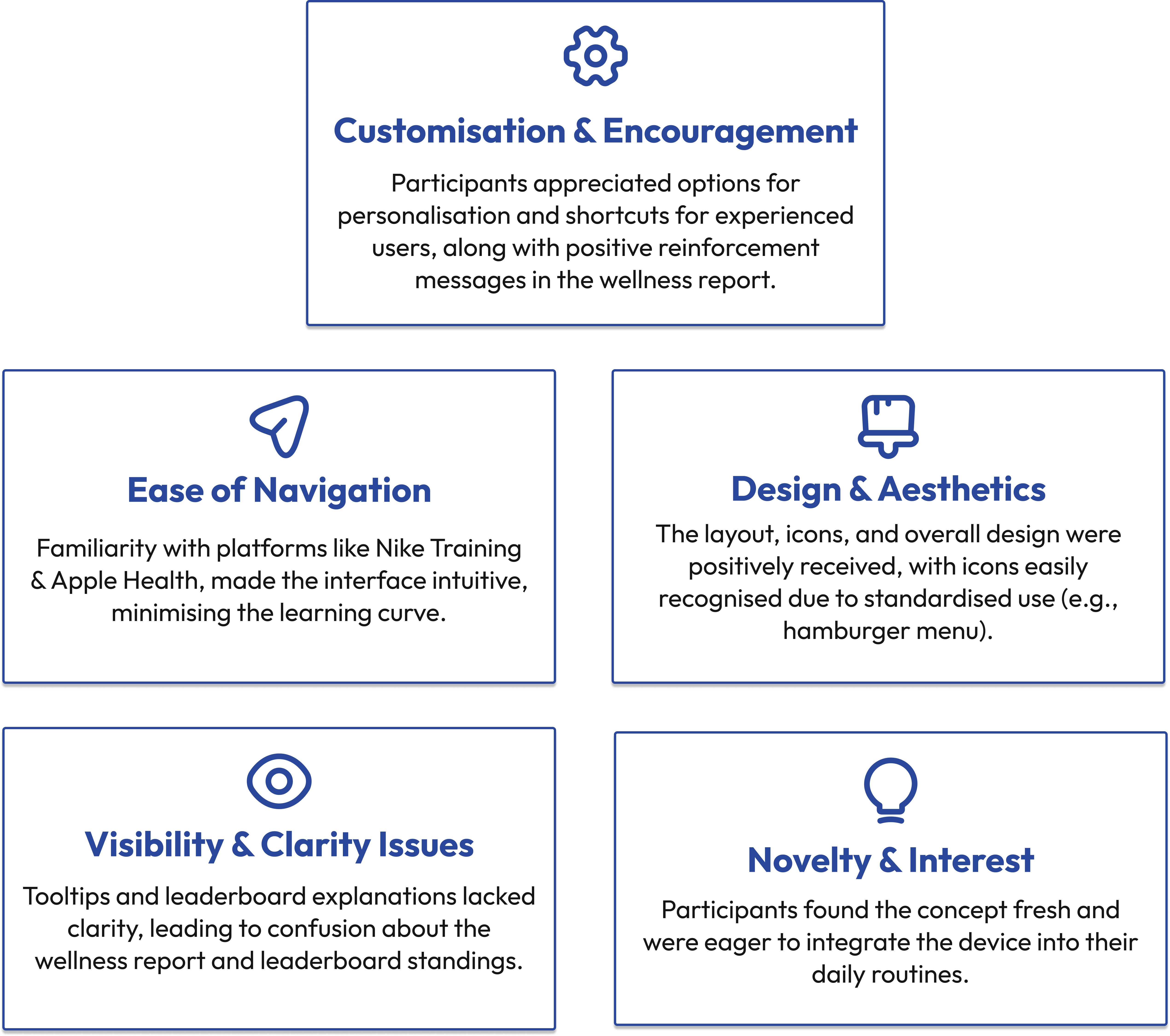
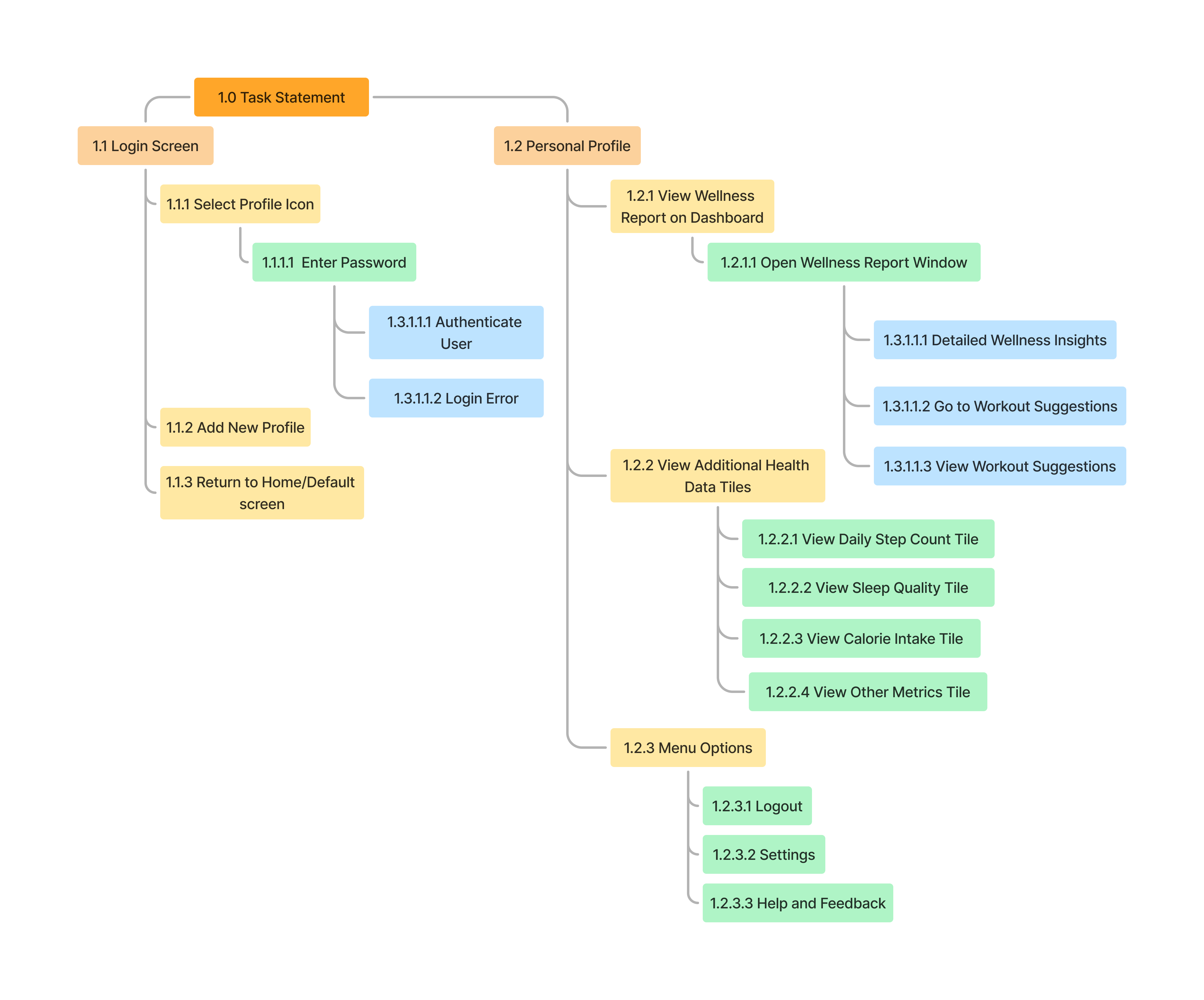
The team also conducted Hierarchical Task Analysis (HTA) and Heuristic Evaluation to identify areas for improving the user flow and minimising errors.
We utilised HTA to break down the user’s journey into smaller, manageable steps, allowing us to:
Simplify Complex Tasks: The breakdown helped identify pain points or inefficiencies in users' processes.
Understand Interactions: It provided a detailed view of how tasks relate to each other, guiding design improvements.
Prioritise Features: Insights from HTA informed our decisions about which features or enhancements would most benefit users.
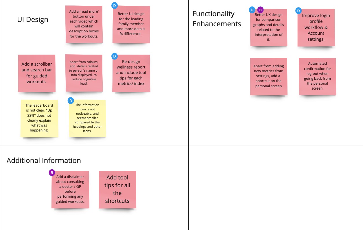
Using Jakob Nielsen's 10 principles, we evaluated FitShare through three key tasks, identifying areas for improvement:
UI Enhancements: Improve comparison graphs with clearer labels and progress details.
Wellness Reports: Add tooltips for better clarity on metrics.
Navigation: Streamline login and account settings.
Workouts: Add disclaimers, tooltips, and search functionality for guided exercises.
The FitShare design was shaped by user co-design through interviews, brainstorming, and testing. This early involvement helped address key needs like privacy, customisation, accessibility, and encouraged family wellness tracking and friendly competition.
Future Directions
Designing FitShare reinforced the importance of user-centred thinking at every stage—from research to iteration. Here are my key takeaways: