Civic Compass is a feature offered by Empowered Vote, a nonprofit organisation dedicated to promoting informed and engaged civic participation through digital tools. The feature helps users map their political stances against leaders and other participants, providing a clear visualisation of alignment on topics such as healthcare, immigration, economics, and social policy.
Problem
Civic Compass, a feature by
Empowered Vote, helps users map their political stances against leaders and other
participants. The original version presented users with a long list of survey questions,
each offering up to ten stance options. Only after completing the entire survey could users
view a static spider graph of their results. This made the experience cognitively demanding
and disengaging. Users couldn’t see how their responses shaped their civic identity in real
time. Navigation was inconsistent, and key buttons were often hidden below the fold, leading
to accessibility challenges and frustration.
Why this matters?
For many people,
understanding politics can feel complex and overwhelming. The Civic Compass addresses this
by providing personalised, interactive visualisations of political stances, presenting
shared facts, and making civic participation engaging and intuitive helping users explore,
learn, and align their beliefs with real-world data.
Solution
The Civic Compass is being
redesigned to provide a more engaging and intuitive experience. The design is now focused on
simplifying the stance selection workflow, integrating real-time visual feedback, and
providing optional comparison modes that allow users to see how their positions align with
politicians and other participants.
My Role
UX Designer (Part-time, Remote, ongoing)
Duration
August 2025 – Ongoing
Civic-minded individuals and all eligible voters in the USA (aged 18+)
- Simplifying stance selection and reduce cognitive load.
- Providing real-time visual feedback of user positions.
- Enabling comparison with politicians and other participants.
- Presenting political information clearly and accessibly.
- Increasing user engagement and understanding of civic issues.
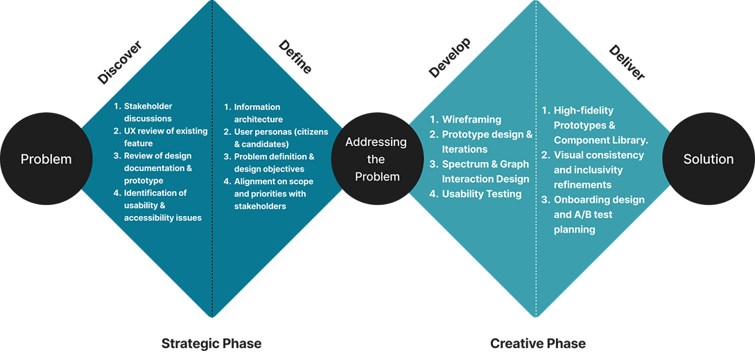
As the UX Designer for this
project, I was responsible for shaping the entire user flow and overall design of the Civic
Compass feature. From identifying usability challenges in the existing version to crafting a
more intuitive and engaging experience, my work focused on creating clarity, simplicity, and
meaningful interaction.
- Owned the complete UX design and user flow for the Civic Compass feature
- Led the redesign process from concept sketches to high-fidelity prototypes
- Created personas for both citizens and political candidates
- Defined the information architecture and refined interaction patterns
- Built reusable component libraries to maintain visual consistency
- Established interaction specifications and accessibility guidelines
- Collaborated with the researcher and stakeholders for iterative feedback
- Coordinated with developers to ensure feasibility and smooth handoff
-
Stakeholder Conversations
The process began with a series of stakeholder conversations to understand the vision for the Compass and identify the pain points that needed immediate attention. These discussions revealed a shared frustration with the existing experience, users were required to scroll through lengthy surveys, the navigation buttons were hidden or inconsistently placed, and the feedback after completing the survey felt static and uninspiring. Stakeholders wanted the tool to not only feel more intuitive but to empower users by providing meaningful, real-time feedback on their civic stance as they interacted with it.
-
Existing UX
Review
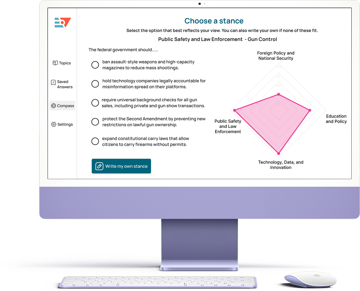
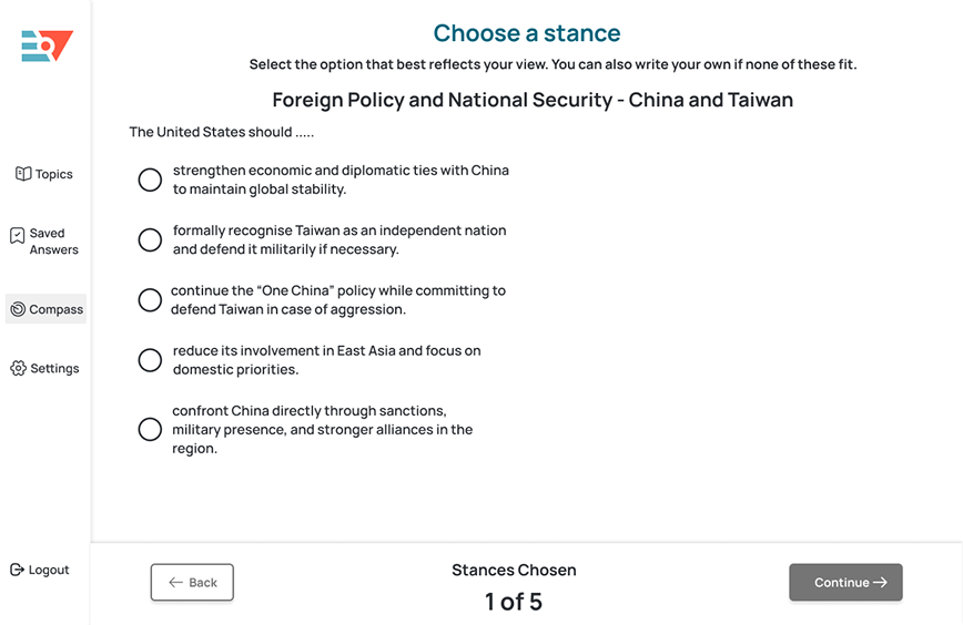
To get a holistic view of the problem, I conducted a UX review of the existing version of Civic Compass. The earlier version included topic selection screens where users could choose from an array of topics and subtopics. However, navigation was inconsistent with the 'Continue' and 'Back' buttons hidden below the fold, requiring unnecessary scrolling and deadlinks.
In the survey phase, users faced up to 10 stance options for each topic, with varying scales that felt cognitively heavy. The experience concluded with a static spider graph that appeared only at the end of the survey, offering no interactive insight along the way. This made the experience feel disconnected, especially when users wanted to understand how each choice influenced their overall alignment.
-
Reviewing Existing
Design Assets
I explored the existing Figma files, and design documentation to understand the product’s structure and constraints. This review helped establish how much of the foundation could be reused and which elements required redesigning from scratch. It also clarified the workflow between designers, developers, and stakeholders, which later shaped how collaboration was structured throughout the project.
-
Identifying Problems
and Pain Points
From the review, the key issues became clear:
- The experience was overwhelming due to the excessive number of stance options.
- Navigation was inconsistent, with controls often hidden or misplaced.
-
- The static spider graph made it difficult to connect user input with outcome.
- Accessibility concerns such as colour contrast and button reachability reduced usability.
These findings set the foundation for the next phase which was defining the problems to
address and scoping what could realistically be achieved in this redesign.
Framing the Core Problems
With the insights gathered, I reframed the issues into actionable design problems. The challenge wasn’t just to simplify the interface but to transform the user’s journey into one that felt engaging, dynamic, and reflective.
The design goals became:
- Simplify the survey structure by limiting stance options to a manageable and consistent range.
- Enhance clarity through real-time visual feedback that makes users feel in control of their stances.
- Create consistent navigation and accessibility across every interaction.
- Encourage inclusivity and self-expression by allowing users to share their opinions in their own words.

Understanding the Users
Two primary user groups were identified i.e: citizens and political candidates. To ground the design in real behaviour and motivation, I developed personas representing both:
These personas helped ensure that every design decision served both ends of the interaction providing clarity for citizens while maintaining transparency for candidates.
Information Architecture
Before making any design changes, I created an information architecture map of the existing Civic Compass. The goal wasn’t to redesign it yet, but to understand how users currently moved through the tool and where they might face friction. Mapping the flow helped me visualise how disconnected the journey felt
-
1st Iteration:
Improving Navigation and Simplicity
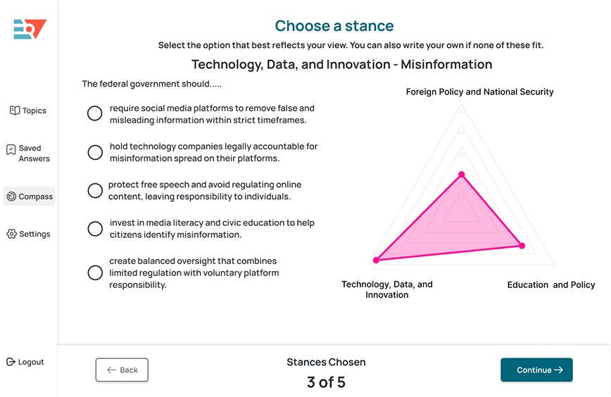
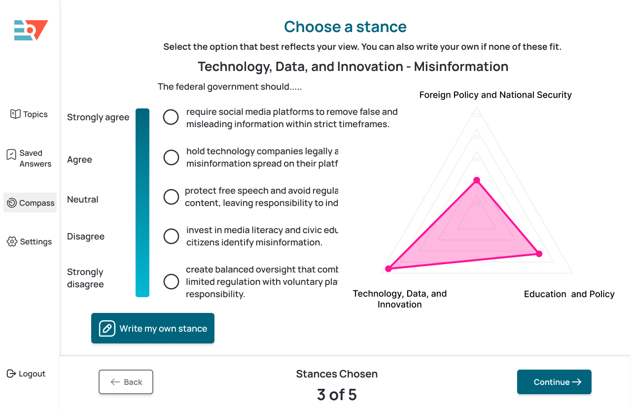
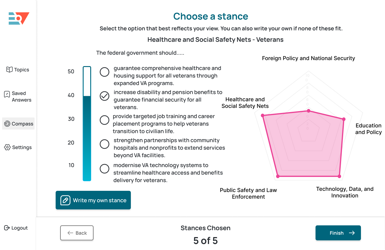
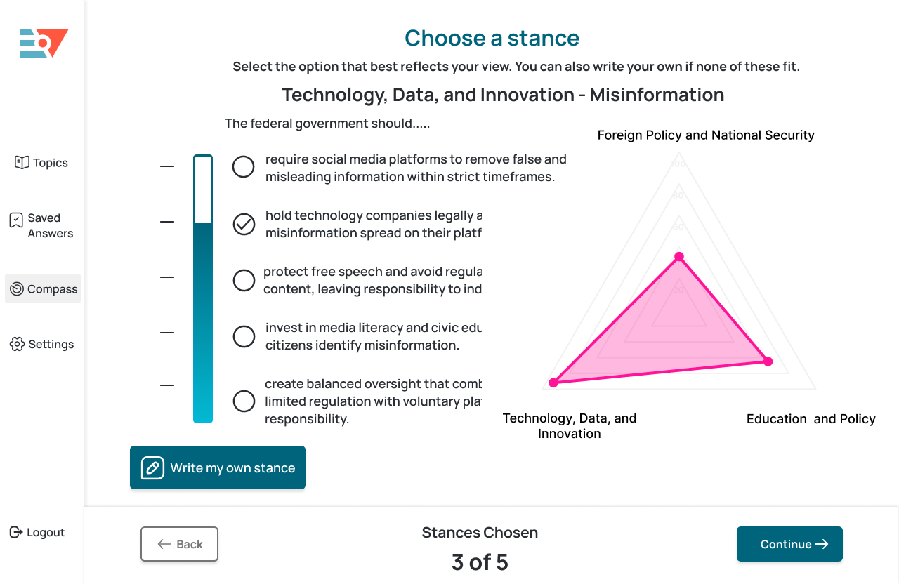
The first design iteration focused on fixing fundamental usability problems. Navigation buttons were repositioned and fixed at the bottom of the screen, ensuring they remained visible at all times. The survey experience was simplified, offering five consistent stance options i.e: from Strongly Agree to Strongly Disagree.
A live spider graph was introduced to update dynamically as users made their selections. This real-time visualisation turned abstract data into tangible feedback, allowing users to see how their stance shaped their overall position instantly.
-
What lead to the next interation?
While this version improved usability, feedback showed users still wanted more personal expression beyond predefined choices. This inspired the idea for a Write Your Own Stance feature in the next iteration.
-
2nd Iteration:
Personalisation and Interactivity
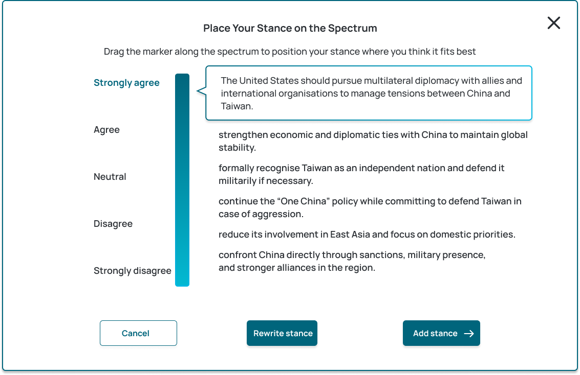
To move closer to the mission of making civic dialogue more inclusive, I designed a feature called Write Your Own Stance. Users could articulate their personal opinions in a modal text box and then drag their response along a vertical spectrum from Strongly Agree to Strongly Disagree. This made the process feel more flexible, personal, and empowering..
-
What lead to the next interation?
While stakeholders appreciated the enhanced interactivity, they wanted to explore how different visual formats could further clarify user responses and graph updates. This prompted the idea to create A/B variations for internal review and upcoming user testing.
-
3rd Iteration:
Visual Refinement and A/B Preparation
Based on collaborative discussions, I designed two prototype variations to test visual feedback styles and data clarity:
-
Version A: Included numeric intervals (10–50) for more granularity.
Each stance was represented on a vertical spectrum labelled with numeric intervals (10, 20, 30, 40, 50). The idea was to help users quantify their choices and understand how small shifts in opinion translated into measurable differences on the spider graph. -
Version B: Notches instead of the numbers.
It replaced numbers with soft notches and animated gradients, creating a more intuitive and organic experience. As users dragged their stance indicator, the spectrum filled with colour dynamically, giving a real sense of movement and ownership.
-
Version A: Included numeric intervals (10–50) for more granularity.
-
What lead to the next interation?
During internal reviews, both versions were praised for clarity and interaction, but stakeholders noted opportunities to strengthen accessibility contrast and visual hierarchy especially in how the graph and stance spectrum coexisted. These insights guided the next iteration, where the focus shifted to harmonising layout, improving accessibility, and introducing features like the Invert Scale toggle for perspective diversity. This iteration represented the most balanced version of Civic Compass so far which is visually engaging, accessible, and aligned with Empowered Vote’s mission. The A/B testing phase is currently being planned to validate which spectrum style (numeric or notched) better supports clarity and engagement.
-
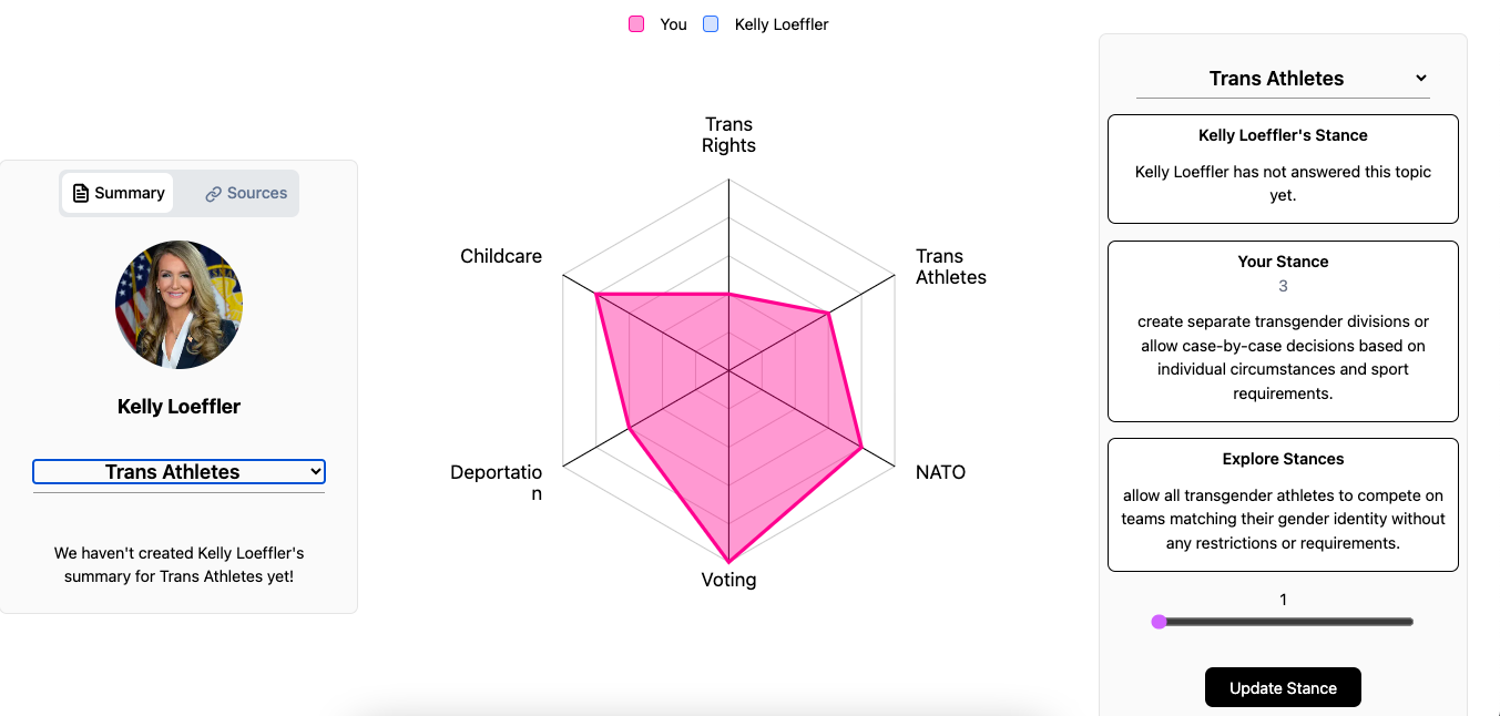
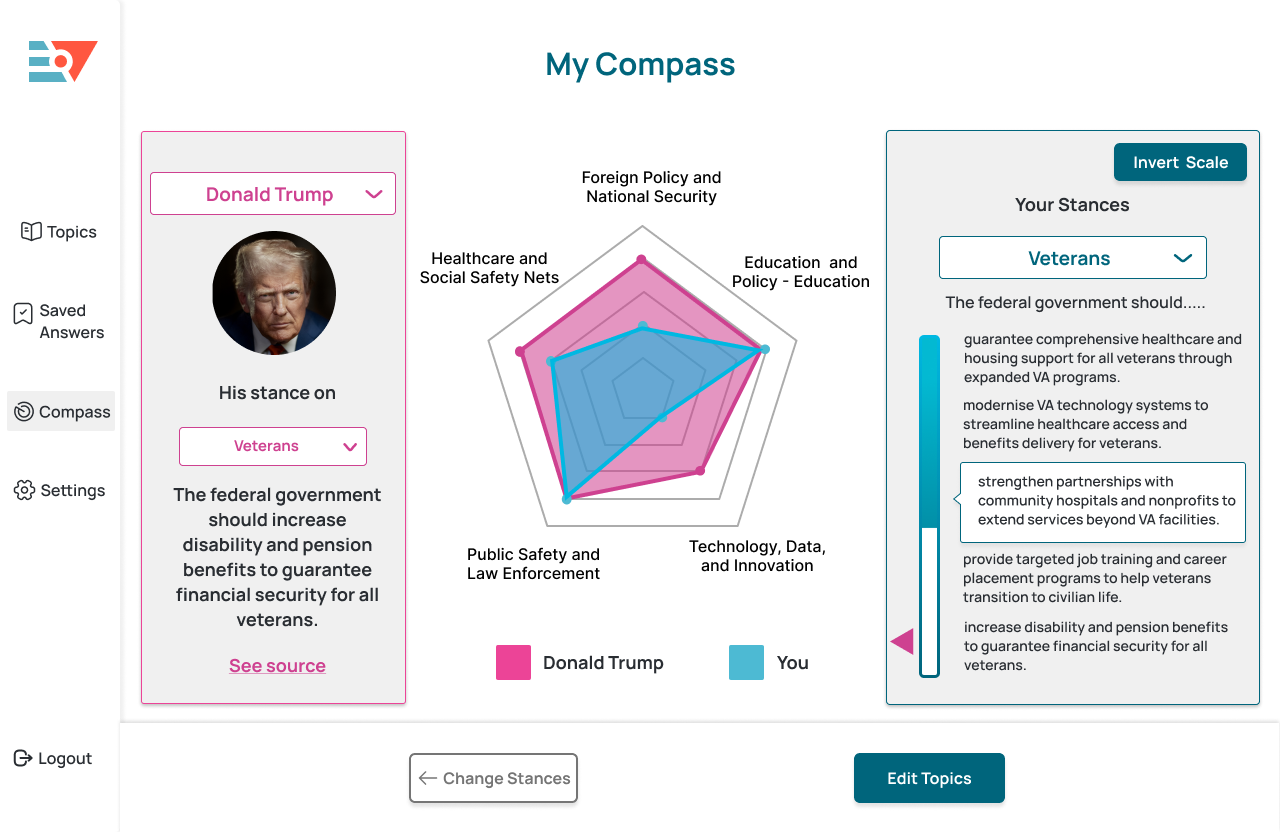
Redesigning the Comparison Screen
The comparison screen is a key component of the Compass which underwent a complete overhaul. The original screen displayed a static graph with vague buttons and no contextual explanations.
In the redesigned version: - The left panel allowed users to select a politician, view their summary, and access their sources.
- The centre displayed a dynamic spider graph that updated in real time as selections changed.
- The right panel showed the user’s stance spectrum with draggable options and the Invert Scale feature.
- The bottom navigation was made persistent, including Edit Topics and Change Stances buttons.

-
Feedback and Current Progress
Stakeholder feedback was overwhelmingly positive. The simplified navigation and clear user flow significantly improved usability. The 'Write Your Own Stance' feature was seen as a major value addition, enhancing user agency, while the 'Invert Scale' button was accepted for its inclusivity and alignment with the organisation’s mission. - Currently, the team is working on designing an onboarding flow to help new users understand the Compass quickly, alongside ongoing participant recruitment for the A/B testing study.